This is a post originally published on my blog, Epic Randomness, but since I feel it’s an important issue and needs to be seen by as many people as possible, I have been given permission to re-publish it here on BSR.
It’s no secret that I love digital comics. They cut down on space, fire hazards, and it’s a nice and easy way to look for a specific issue. That being said, the vast majority of comics available digitally are no older than 10-15 years. Maybe 20 at the most. When older comics are released digitally, they have usually been recolored, resulting in a much more vivid look, without the pitfalls of newsprint (bleeding edges, yellowed pages and the like). That is, until now.
DC Comics, in their partnership with comiXology, have recently released a slew of bronze-age comics digitally, mainly to coincide with their “RetroActive” line of one-shots. This initially had me thrilled! Not only can I get a bunch of comics that had never been reprinted before, I could get them for a measly 99 cents apiece. Joy and Rapture, DC was finally digging into their 70+ years of archives to share their catalog. Then I actually bought some of the books…
The book I’m using to highlight my point is Justice League of America #120, which has a cover date of July, 1973. It ties in really nicely to the recent “DC RetroActive 1970s Justice League of America #1”. They both feature adventures of Adam Strange dealing with the villainy of Kangar-Ro. When you open the digital version, this is what you get (page truncated for detail):
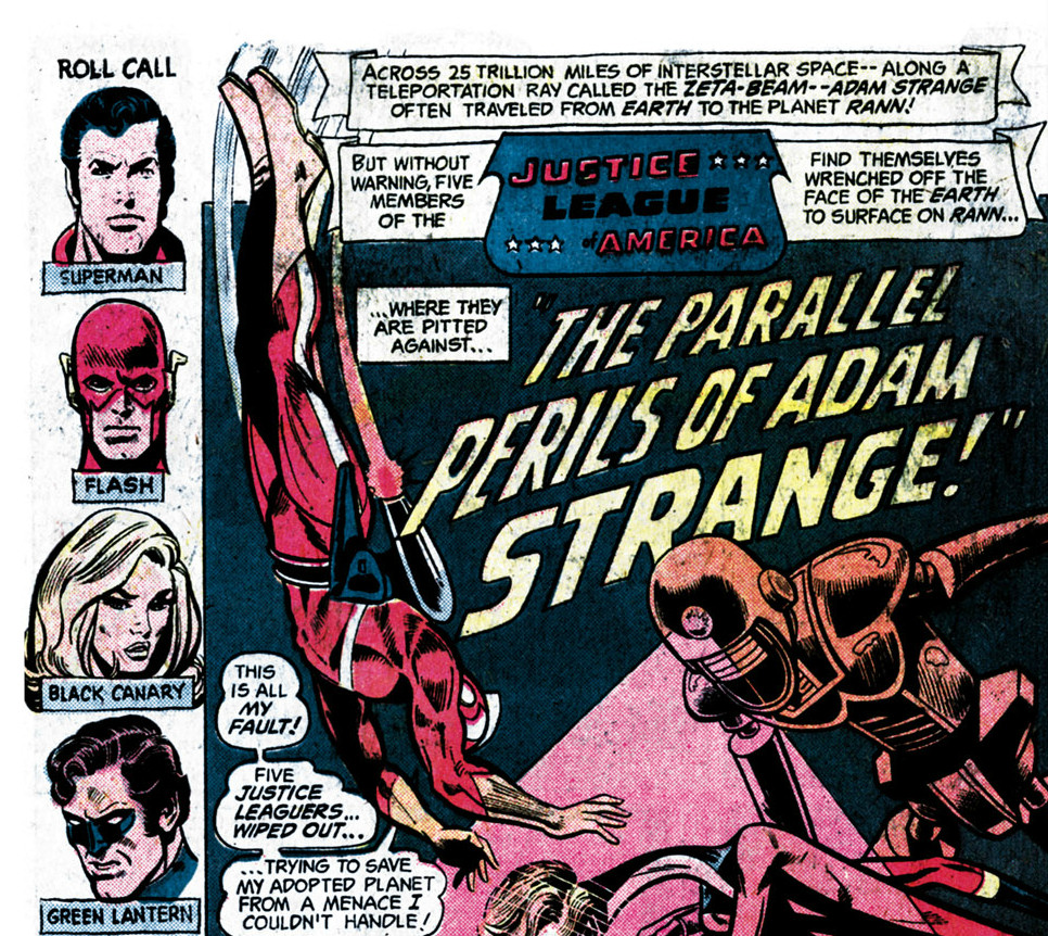
JLofA #120 via comiXology
I’m sorry, but I believe the correct term for the image quality is fugly. This is obviously a scan taken from an original newsprint issue, but someone was screwing around in Photoshop too much to make the yellowed newsprint look white. As a result, the image looks very washed out, and is kind of a chore to read. In short, I felt a bit cheated of my buck. As an aside, when Marvel releases a bronze age book, be it on Marvel’s Digital Comics Unlimited, or their comiXology powered app, the book always gets the re-color treatment.
So, being appalled by the (lack of) quality of the book, I decided to see if I could do any better. Surely if I could do a better job at presenting one of their books digitally, DC would wise up and not pull this on their consumers again, right? That’s what I’m hoping, at least.
I made two plans of attack when trying to make my case. First, I just got a scan of the page myself with no frills, just to show what the page would look like if you actually opened up a paper copy:
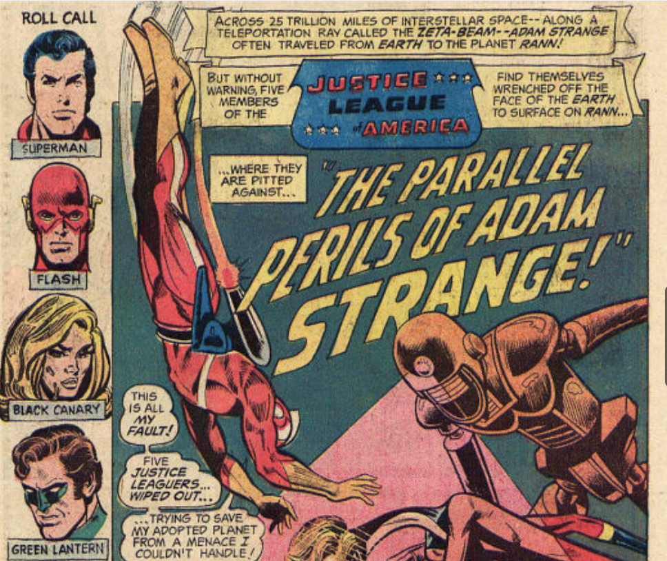
JLofA #120 via scanned copy
As you can see, while the scanned page isn’t as white as the one available for purchase digitally, there are more discernible details. For instance, the caption boxes are actually yellow, the blues in particular look better, and the background itself doesn’t turn almost completely black. If DC decided to release the comic like the above image, I’d still wonder why they didn’t re-color it, but it would at least be readable and I would be a satisfied customer.
So the question of course is why? Why didn’t DC take the time to re-color the book for digital release? I’m sure arguments could be made that it is cost-prohibitive, or too painstaking a process to do for a single digital issue they don’t plan on releasing anywhere else. If that’s the case, it speaks volumes about how DC feels about digital. Sure, they are about to release their entire line digitally the same day as print, but moves like this make me imply that they do not care about their digital presentation. Even if digital is just another revenue stream for them, wouldn’t it behoove them to make it appealing enough to have repeat customers?
While I am of course just speculating, I decided to put my money where my mouth is. Would it cost DC any sort of money besides labor to re-color their classic books? The short answer I came to is “no”. Using only free tools, I was able to re-color this page in less than 20 minutes, here is the result, and then I’ll explain my process.
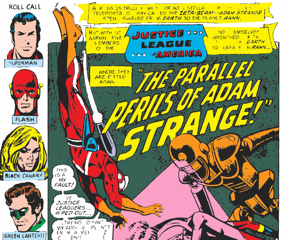
JLofA re-colored by me.
Admittedly, my attempt is slightly crude. If you’ll notice, some letters are missing, and some lines aren’t there. There is also some artifacting in the background. This is due to me working from a scanned image. I would hope DC’s own archive has better tools than I do. As for what I did, I got to thinking about the original printing process. Mind you, I’m not a colorist, but I do know that in newsprint, the CMYK process is used. CMYK uses Cyan, Magenta, Yellow and Key (black) to make all variety of colors. This is why comics are sometimes referred to as 4-color adventures. Anyway, with that in mind, using free tools, I converted the my scanned image into CMYK color (most computer images use RGB). After I did that, I was able to isolate the Key plate, which was akin to just have the black and white ink work.
From there, I used the colors from comiXology’s copy of Justice League of America #122, which ironically was recolored, due to it being reprinted before. Here’s the image I got my new RGB values from.
JLofA #122 used as a color guide
From there, it was a simple process of adding the colors where appropriate. Now don’t get me wrong, doing this to every page of every issue released would take a lot of time, but if I, a relative novice can be that effective using only the tools at my disposal, all I can say about DC at this point is that they are lazy. That being said, if anyone at DC is reading, pay me a modest sum and I will do this for you, gladly, Just to preserve your classic work for not only a new generation of readers, but for all time.